
What we post / 8–14 Day Outlook
8–14 Day Outlook
What it shows
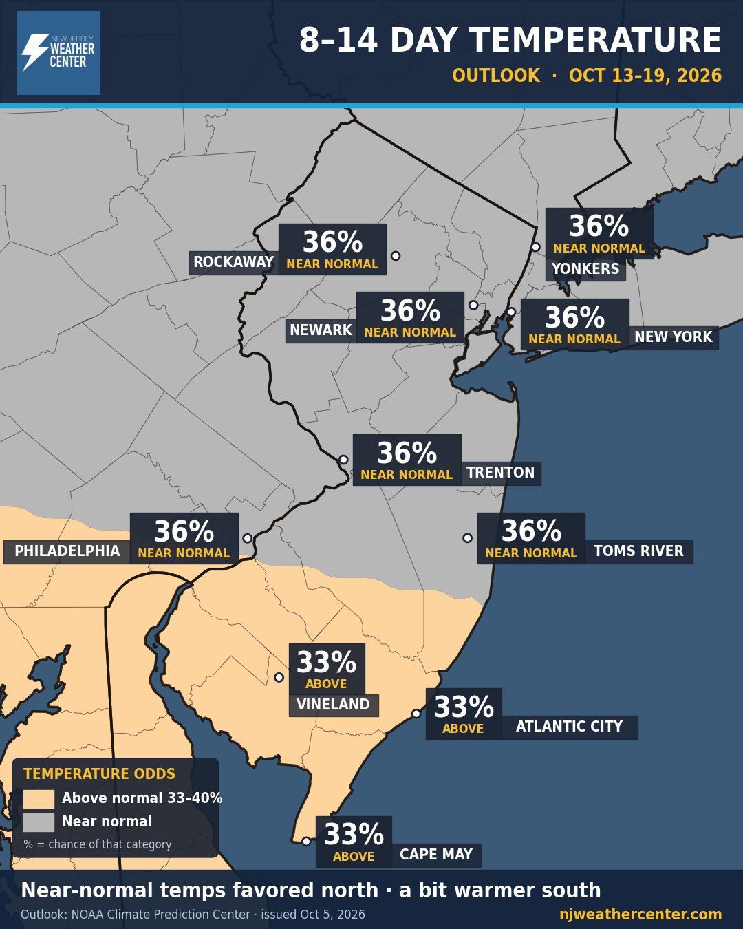
The long-range look at week two: the odds that the 8 to 14 days ahead run warmer, colder, wetter or drier than normal for that time of year. It's not a day-by-day forecast. It's how the whole week is tilting.
How to read it
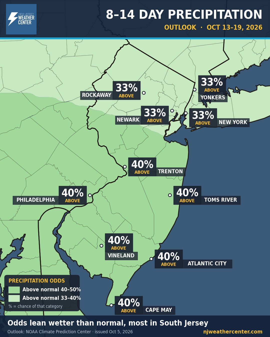
- The colors are categories. Oranges mean warmer than normal and blues mean colder (on the rain map, greens mean wetter and browns mean drier). Gray means near normal.
- The percentage is the chance of that category. Each map has three possible outcomes (above, near or below normal), so 33% is about what you would expect by pure chance, and anything 40% or higher is a real lean.
- "Normal" means the 1991–2020 average for those dates. A 40% chance of wetter than normal doesn't mean it rains 40% of the time. It means the week as a whole is more likely to end up wetter than usual.
When we post it
Updated every day. NOAA's Climate Prediction Center issues a new 8–14 day outlook each afternoon.
Where the numbers come from
The official 8–14 day outlook from NOAA's Climate Prediction Center, drawn on our map. We never change the odds. For dangerous weather, always follow official National Weather Service warnings and your local emergency officials.
Precipitation outlook
Every outlook comes as a pair: one map for temperature and one for rain and snow (precipitation).
Reading the two together
- Warm and wet often means rainy, mild days. Cold and wet in winter is when we start watching for snow.
- The further out you look, the lower the confidence. That's why the percentages usually stay in the 33–60% range.
- For the next 7 days, use our 7-Day Forecast instead. It's built from the National Weather Service day-by-day forecast.